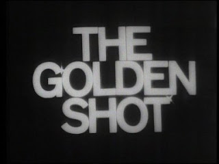
The first documentary Rory asked me to contribute to was "A Shower Of Shot" - a half hour history of the popular ATV Sunday afternoon game show "The Golden Shot". The Golden Shot is one of my earliest television memories, so it was something I was delighted to contribute to.
Left a bit, right a bit, fire!
Initially Rory asked me to just create him an opening caption in "one of the Golden Shot typefaces". There were four to choose from. The original Golden Shot title sequences used the one of the "grots" or Grotesque fonts.
Safe, dull, grot.
The colour era heralded something much more exciting - a wonderful "disco" engraved font complete with coloured targets.
Almost illegible, but who cares! ATV graphics at their outrageous best.
The Charlie Williams era was heralded by the strange arts and crafts Arnold Boecklin font. The typeface was as out of place as Williams, so it all made some kind of sense.
Are you alright my flower? No.
Then we get to the transatlantic schmaltzy Stephanie De Sykes and Rain era, with the rather transatlantic schmaltzy looking "Flamenco" face.
Life is a Beautiful Book; your mileage may vary.
There was really no contest as to which font I wanted to use but there was one small problem - I couldn't get hold of the "disco" font for love nor money. I then recalled the advice of a friend, the great Southern/TVS graphic designer Alan Scragg: "I design fonts for clients as a matter of course as part of a design." So I thought I'd try and do a Scraggie and do the same thing.
My plan was to draw the letter shapes in Inkscape for import into Fontforge on Ubuntu GNU/Linux. I was a bit nervous about this font as the nature of the typeface meant that I would be drawing many, many more outlines than I would be drawing for a normal face.
I thought the most sensible place to start was with the lower-case letter "l". I took a screen grab of the end caption from a DVD of the program that Rory sent me. I imported this into the bottom layer in Inkscape so that I could trace over it. I then corrected the geometry of the grab so that the horizontals and verticals of the screen grab were properly straight. Next I cheated a bit - I played with the scale of the screen grab so that the white elements of the letter "l" sat on pixel boundaries. This would make my job in creating the letters much easier. Once I had done this I added some horizontal guides and turned on snapping to guides.
That was an l of a job...
From the letter l, I could see that the letters all followed a consistent pattern. An inner letter, which is 3 pixels thick, two pixel gap, three pixel thick shape, two pixel gap, three pixel shape, three pixel gap, three pixel shape, three pixel gap, three pixel shape, eight pixel gap, five pixel thick shape.
Just to check, I then did the lower case "o", which was easy as it was made out of concentric circles. This worked perfectly so I knew I was on the right lines, so to speak.
My problem was this - creating concentric circles and rectangles was easy. However, how would I create concentric "g" or "f" shapes? Inkscape does have an "Outset" command, that would seem to solve this problem. You give it a shape and it creates an expanded version. However, it gives you no control over how much it expands the shape by. This was no good to me - I needed my shapes expanded by exact amounts.
In the end I resorted to using stroking. In other words, I'd draw the inner shape. Then stroke the inner shape with a two pixel thick stroke. I'd then convert that stroke to a shape and stroke that with a three pixel thick stroke and so on. It was repetitive and slow, but it worked a treat. If any Inkscape gurus can tell me a better way to do this I'd be grateful as there's another engraved font I want to create soon!
After I had stroked a shape and converted the stroke to a fill, I had to remove a large number of extra, unneeded points created by the stroke/convert lines to fill process before I stroked the shape again. This was particularly important as I would be importing my shapes into a font editor later - I needed to keep each one as simple as possible.
This was a lovely "listen to music" type of job that you get with graphics sometimes, but in order I didn't get lost or confused (my default state) I made sure I wrote down where I was on my pad. It ended up looking like this (click to enlarge):
Notice the crossed out alphabet!
The other problem I had was more minor - I had to "make up" the letters that didn't appear in the caption. Luckily it was pretty clear from the style of the letters I had got how the other letters should look.
The next job was to sort out all the letters I had made so I could import them into FontForge 2.0. This was quite a confusing job. In this typeface all of the letters (or glyphs) have a number of "cut out" areas inside them which should not be filled with colour. The font renderer that displays them needs a way of working out which bits of the glyph to fill and which bits not to fill. It does this by looking at the direction in which you joined up the points on each outline (or path).
You have to join up the points that make up outermost path in a clockwise direction (to show it should be filled), the points that make up the next path in in an anti-clockwise direction (to show it should not be filled) and so on. This meant that I needed to know which path was which. To make it easier I filled the concentric shapes in Inkscape with different colours so I could see what was going on.
The outlines got very confusing, thanks to the "targets".
Without the colours, it wouldn't be at all clear that the yellow area was in fact all one outline. The blue area would be a bit of a tricky one to work out as well.
I then exported each letter as a separate .svg file, in the same way as I did for my Central and Picasso faces.
Individual letters as svg files, ready for importing into Fontographer.
The import into FontForge 2.0 was quite straightforward, apart from the fact there seemed to be a bug in the FontForge svg parser. It didn't seem to recognise "corner" points properly which meant I often had to spend time connecting the corner points up by hand. In other words I was a grown man spending hours on end doing dot-to-dots.This bug has since been fixed - which would have saved me hours. C'est la vie...
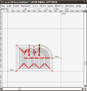
The letter "m" imported into FontForge.
Once I exported the truetype font, I named it "Monkhouse" in Bob's honour. If you want to have a play with the Monkhouse font yourself I've released it under CC-BY-SA and you can download it from here. It's lower case only and has no punctuation. One day I'd like to return to the typeface and finish it off properly.
In a future post I'd like to explain what I actually ended up doing with the "Monkhouse" font, but I think that's been quite enough stupid rubbish from me for one day!
The finished font: Monkhouse.
By the way, the Kaleidoscope event was to raise money for the Prostate Cancer Research Fund, so if you do make use of the font, if you give a few bob for Bob that would be lovely.


No comments:
Post a Comment